FlowMasters
A user-centered approach to demystifying professional workflows.
FlowMasters is a PWA application designed to help students and professionals accelerate their skill development. The platform provides a library of detailed, authentic workflows from vetted experts across various fields, focusing not just on the steps they take, but the principles and rationale behind their methods.
Product
PWA
My role
Lead Product Designer
Timeline
Q1 2025 - Q2 2025
Skills
Competitor analysis
Interactive prototyping
Usability testing
Journey Mapping
The Problem Statement
Aspiring professionals struggle to find centralized, practical workflows from top performers. Existing information is scattered and lacks the actionable detail needed to bridge the gap between theory and real-world application.
Initial Research
My initial research, including a competitive audit, user surveys, and interviews, revealed a crucial insight: users don't just want to know what tools experts use; they crave 'how' those tools create a workflow. This finding became the cornerstone of my product strategy.
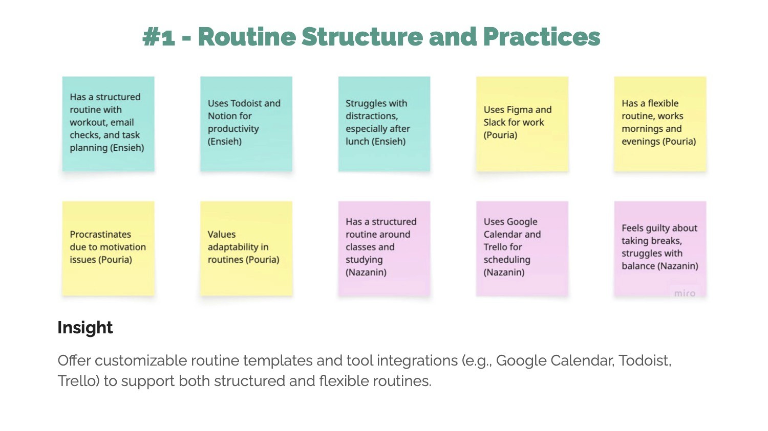
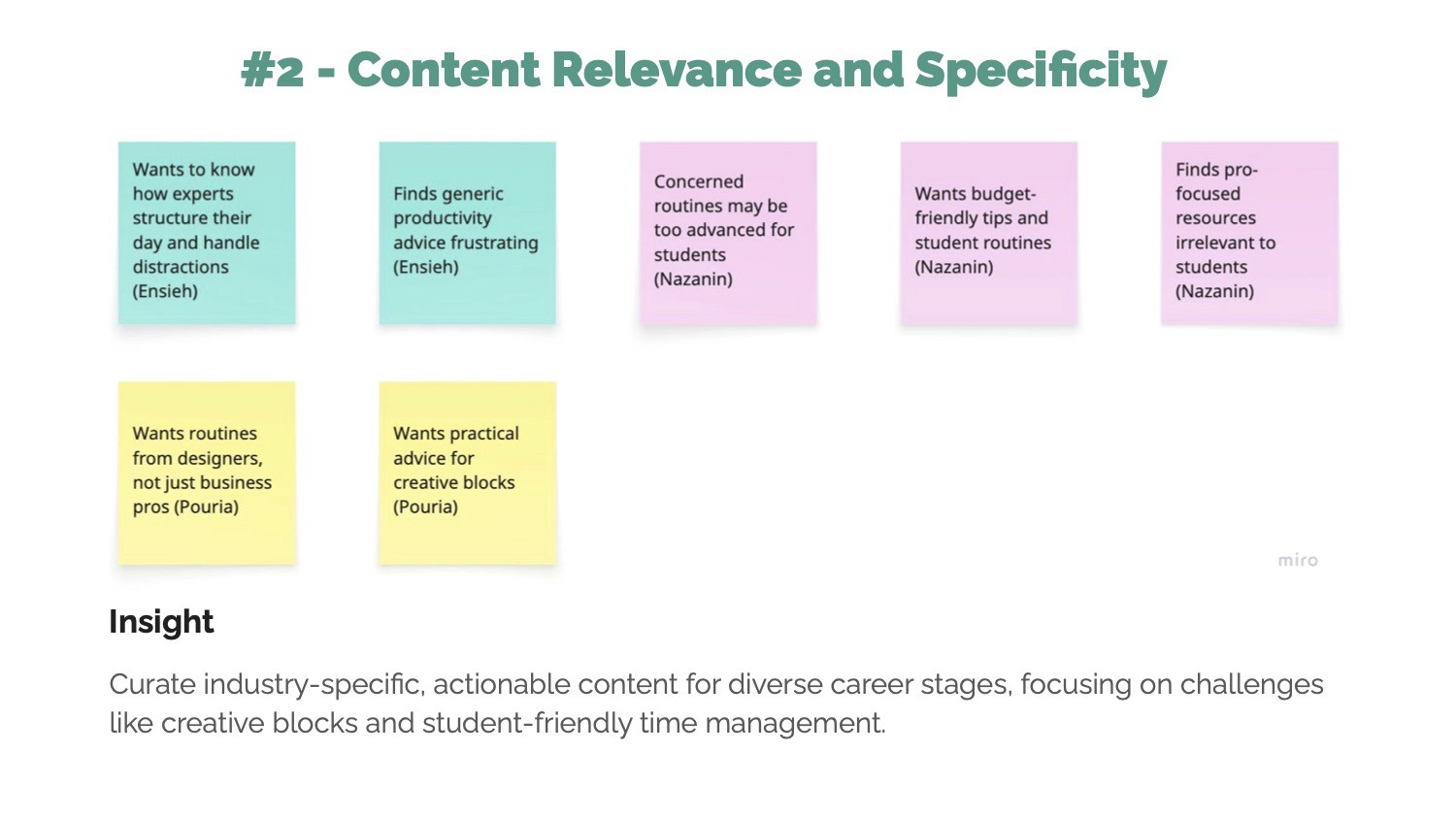

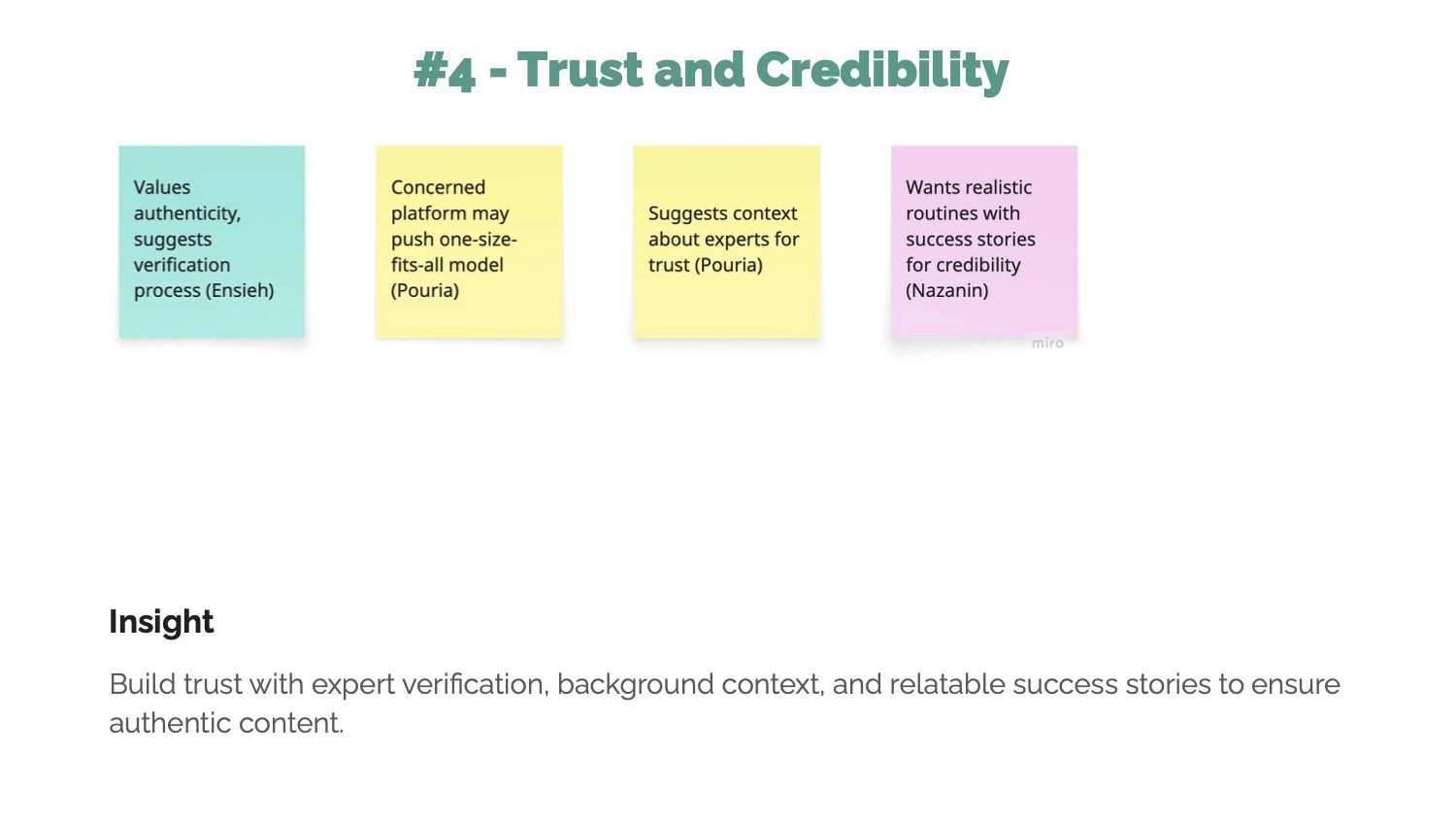
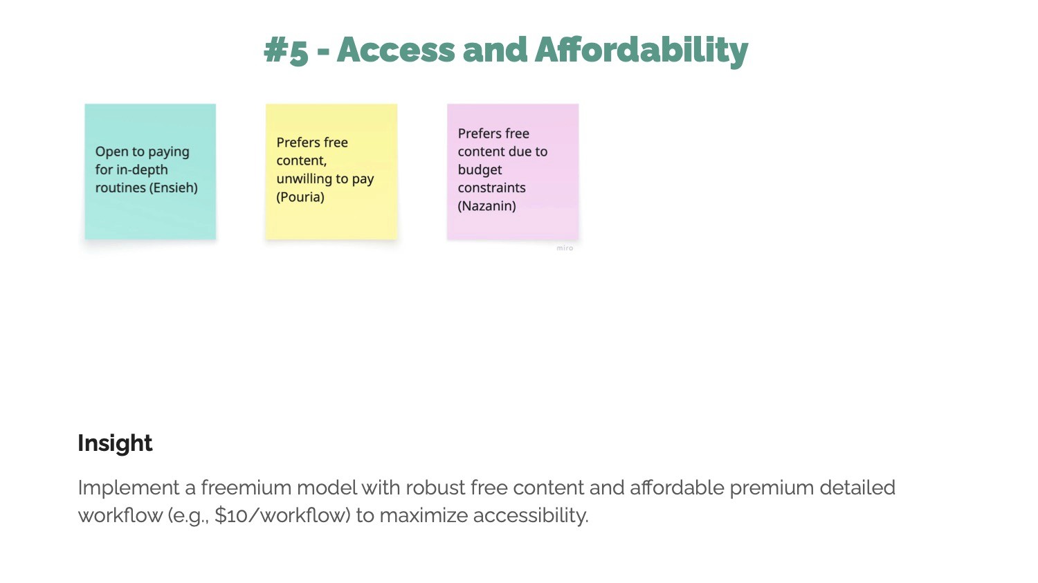
Affinity Themes and Insights
The Design Process
My design process was iterative, moving from broad strategy to detailed execution. My goal was to build a product based on user needs, not my assumptions.
1- Understanding the User
Based on my research, I developed three core user personas to guide my design decisions:
Alex, The Aspiring Developer:
Needs to quickly learn and adapt best practices to accelerate his career.Mary, The Creative Student:
Seeks inspiration and a deeper understanding of how creative theory is applied in the real world.Marcus, The Strategic Professional:
Needs to vet credible experts to solve specific, high-level challenges.
2- Ideation & User Journey Map
With my users defined, I mapped out the primary user flows. The most critical flow was the journey of discovering a workflow, finding it valuable, and saving it for future use. I designed this process to be seamless to encourage engagement and repeat use.
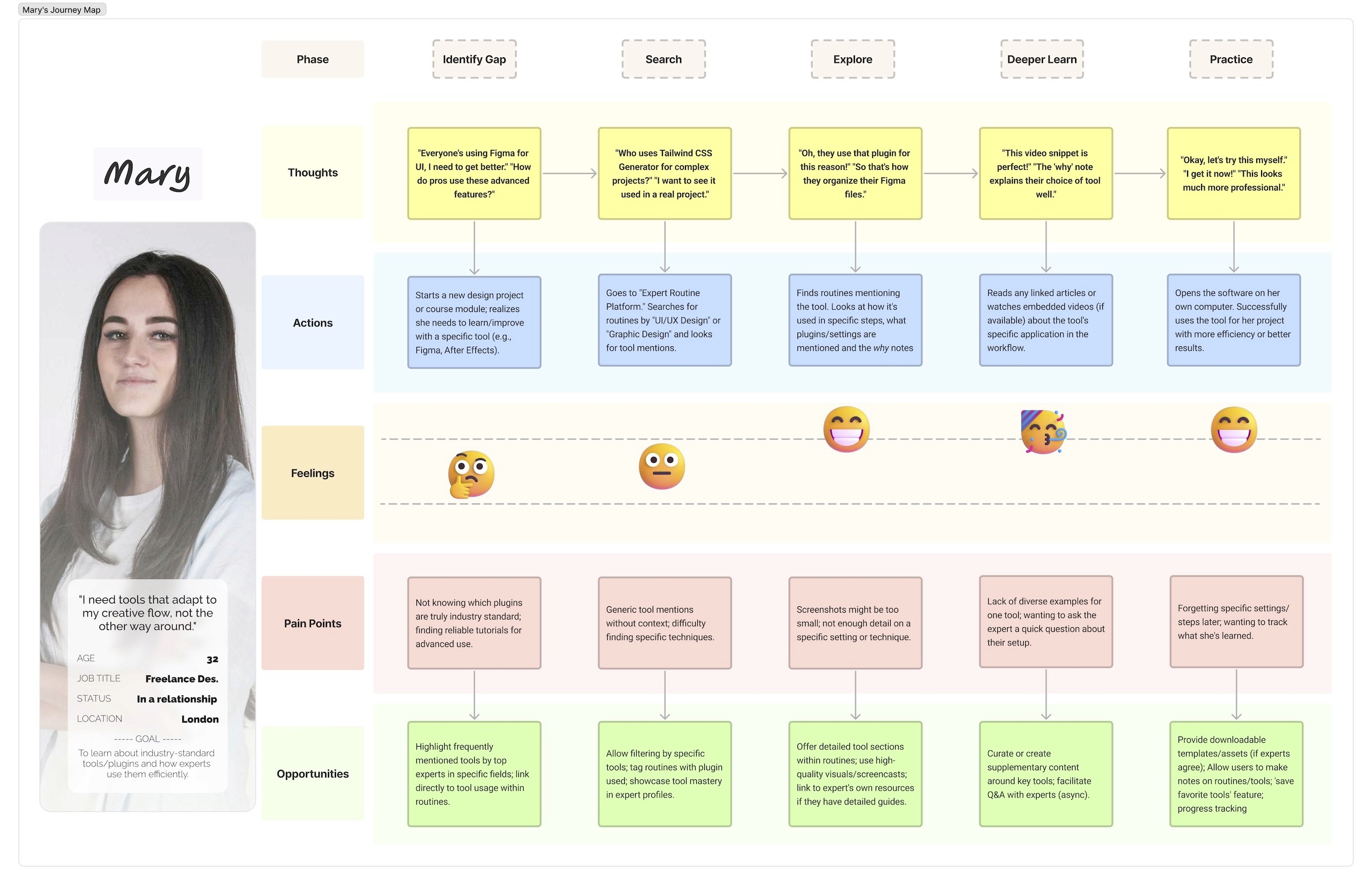
User Journey Map of the Search Function for the Second Persona
3- From Low to High Fidelity
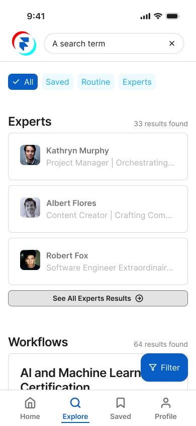
The design of my key screens underwent significant evolution throughout the wireframing process. The "Explore" screen, for example, started as a basic low-fidelity sketch focused on structure. It then moved to a mid-fidelity wireframe where I refined the layout and hierarchy. This iterative process allowed me to test the information architecture before committing to visual design.

Evolution of the Explore tab from Low-Fidelity to Hi-Fidelity
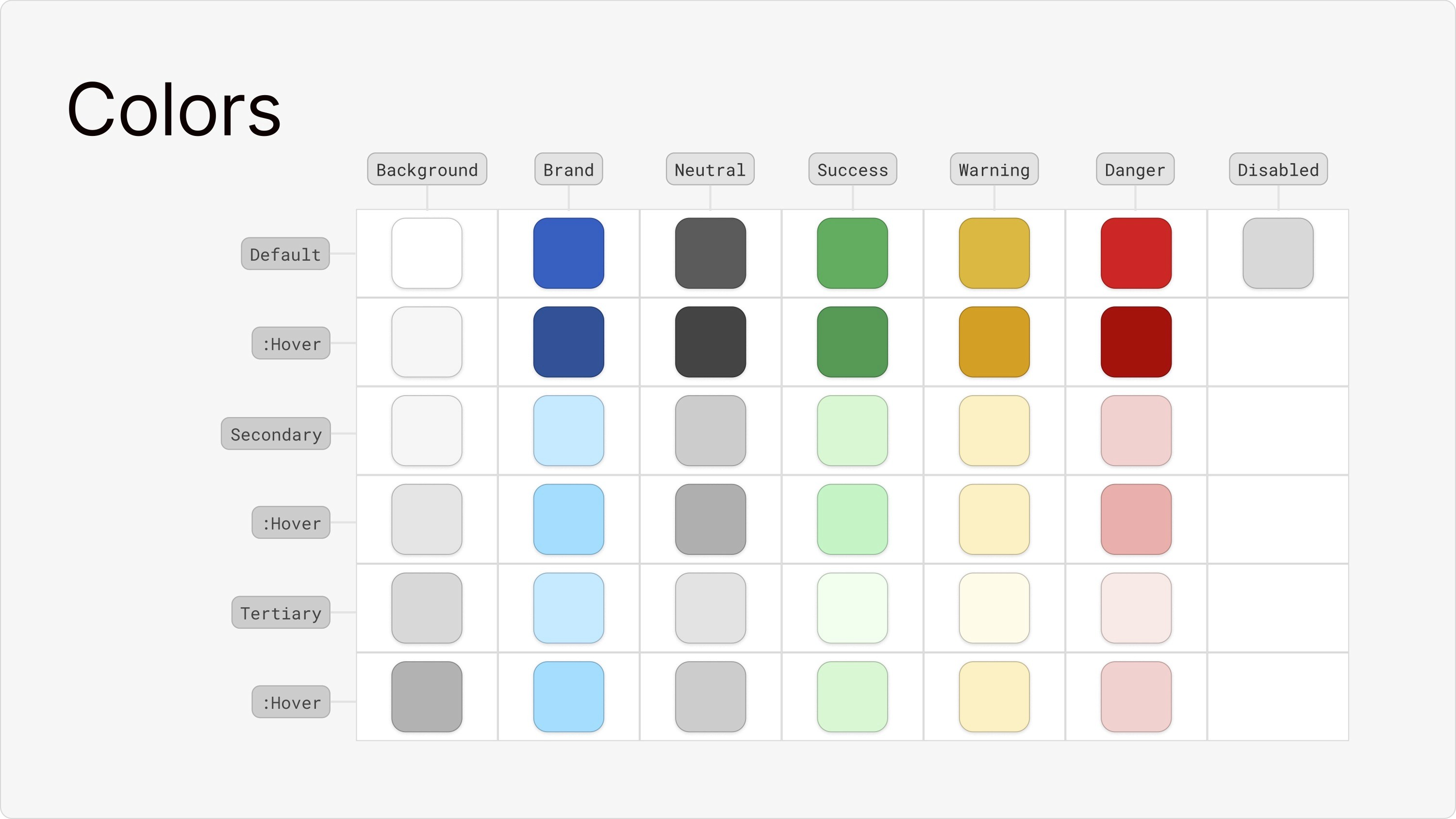
4- Visual Design
I created a comprehensive style guide to direct the visual design, focusing on a clean, professional, and trustworthy aesthetic. I chose a blue tint color to guide user attention to key actions, paired with clean typography for maximum readability. This system ensured a consistent and polished user experience across the entire application.

Validation
My design decisions were only hypotheses until I tested them. The validation phase was crucial for turning my assumptions into evidence-based conclusions.
1- Usability Testing & Core Iteration
My design decisions were only hypotheses until I tested them. The validation phase was crucial for turning my assumptions into evidence-based conclusions through a multi-step process of testing and feedback.
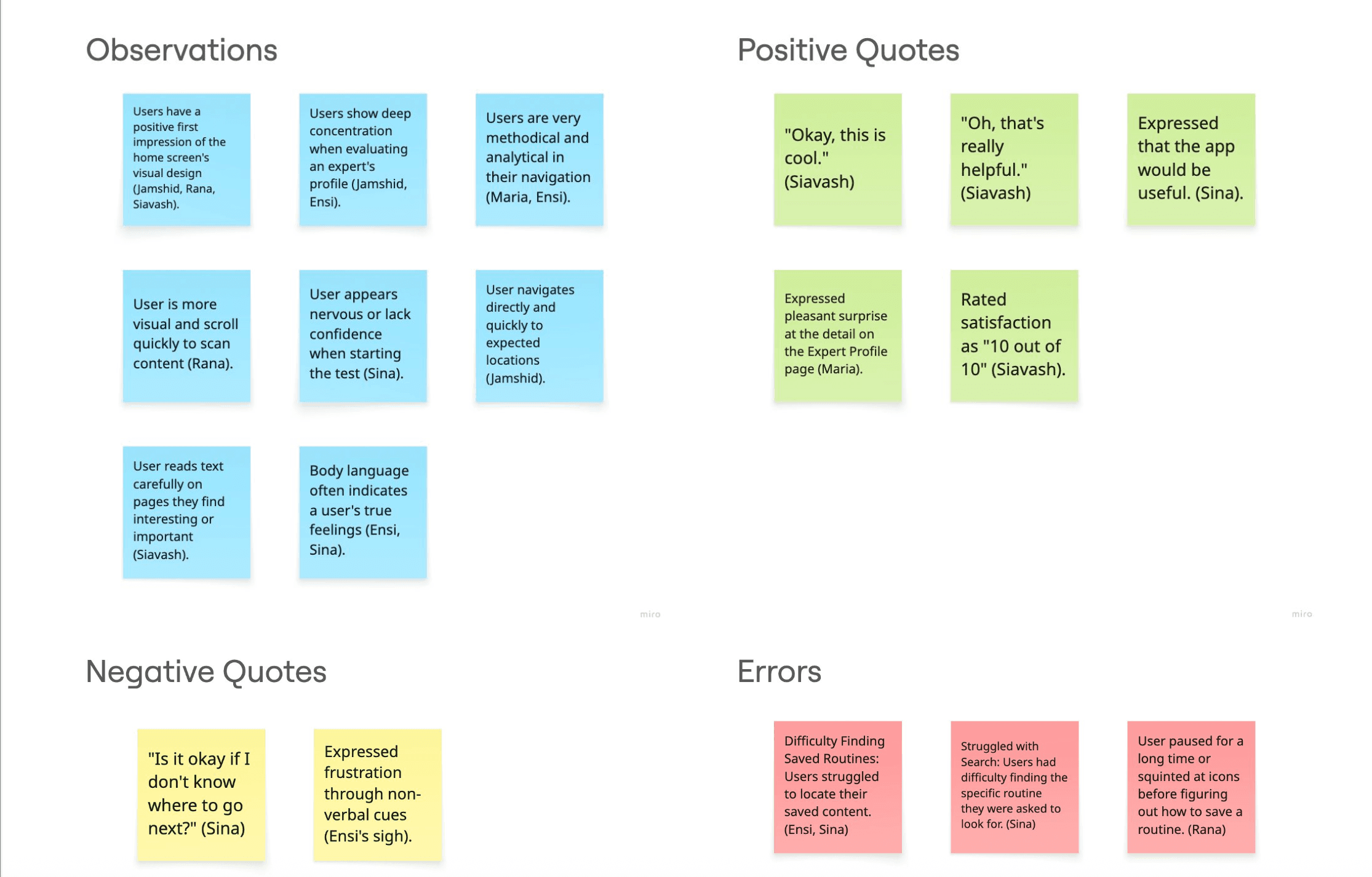
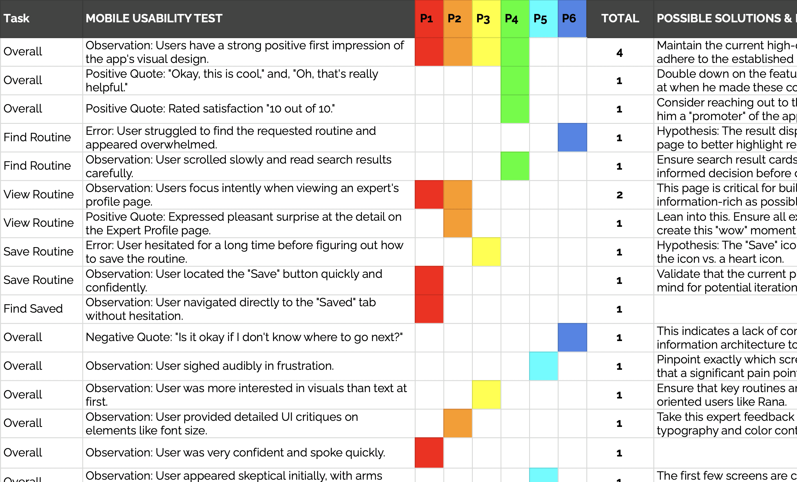
Usability Test Findings

©GIPHY
"Is it okay if I don't know where to go next?"
– Sina | Usability Test Participant –
This quote from a participant trying to find his saved content was a powerful reminder that my initial navigation design was not as intuitive as I had assumed. To solve this, I iterated on the design by adding a clear text label to the navigation bar.
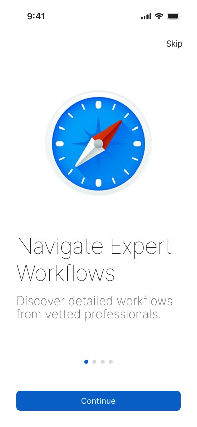
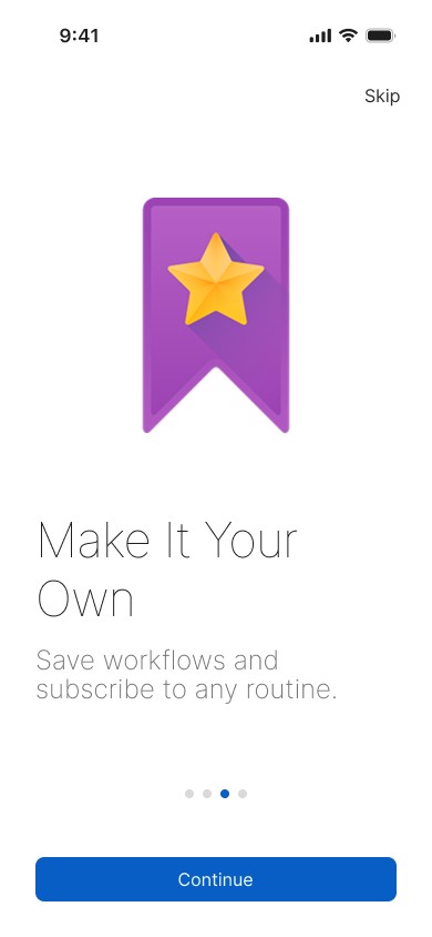
2- Preference Testing
With the core navigation model improved, I next needed to validate my visual direction for the onboarding flow. I conducted a preference test on three variations of the welcome screen. The results were clear: 80% of users preferred the version with the bold, blue compass illustration, giving me a data-driven mandate to move forward with that visual style.
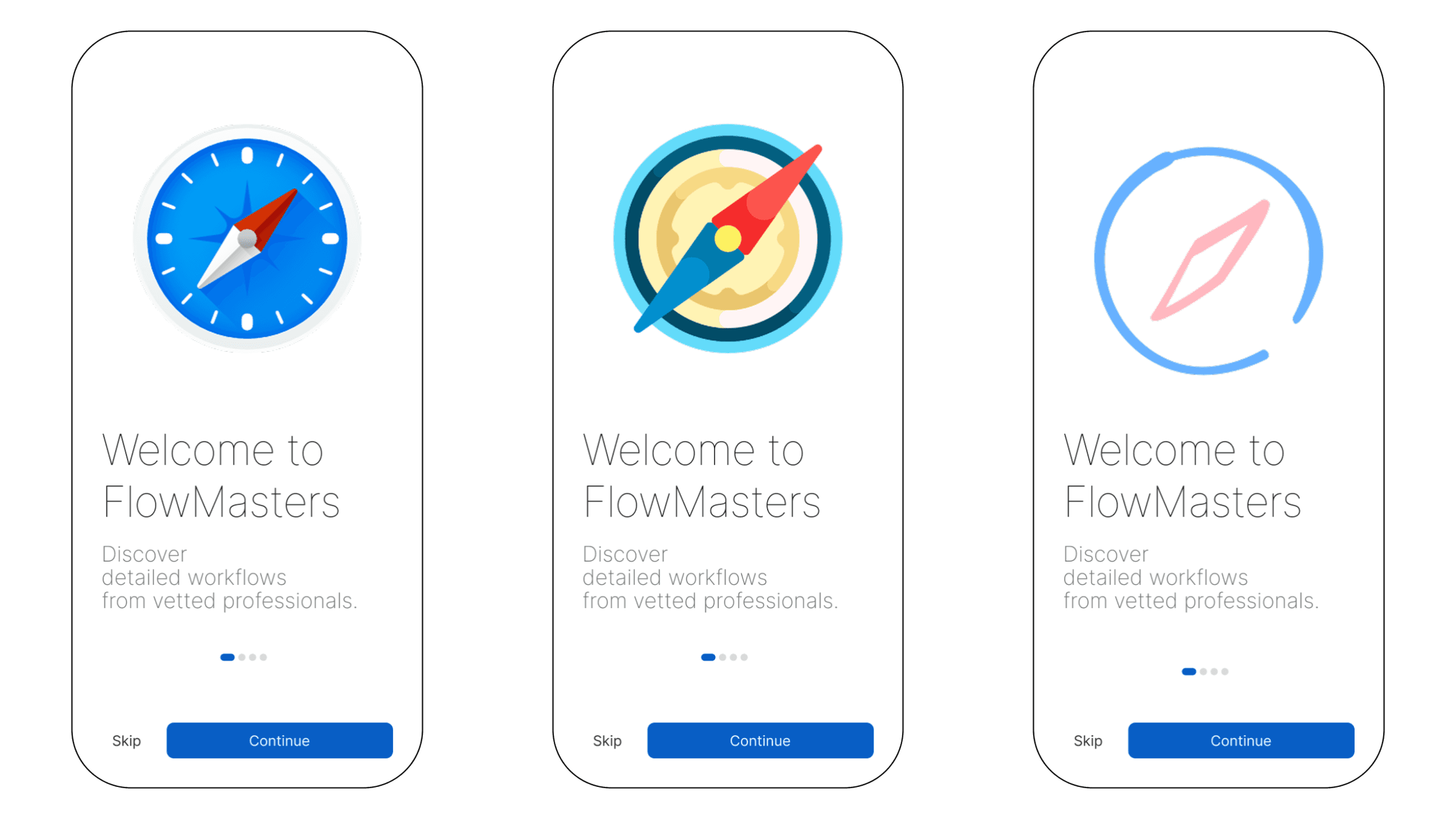
Three variations of the welcome screen for the preference test
3- Peer Feedback & Final Polish
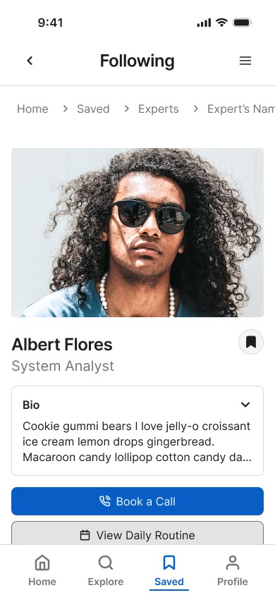
Finally, with the major usability issues resolved and a visual direction confirmed, I gathered extensive feedback on my Figma prototype from my peers as a final touch. This review process was invaluable for polishing the design. Based on this feedback, I added more descriptive job titles to the "Popular Experts" cards to provide better context and refined my copywriting to be more consistent.


Design Comparison Before and After Internal Feedback
Results
The Final Design
The final design is a direct result of my iterative, user-centered process. It is a clean, intuitive, and engaging platform that successfully guides users toward discovering and utilizing expert knowledge.
Impact
The final, validated design directly solves the primary points of user frustration found during testing. By first resolving the critical navigation issue and then polishing the details based on peer feedback, I created a more intuitive path to the app's core value, which is expected to increase user engagement and retention.
Lessons Learned
Test Early, Test Often: The combination of usability tests, preference tests, and peer feedback was invaluable. Each step allowed me to correct my course early, saving significant time and resources.
Separating design assumptions from user reality: Realizing my initial navigation concept was flawed wasn't a failure, but a crucial learning moment that led to a better, more user-centered solution.
The "Why" is Everything: The most positive feedback I received was about the depth of the content, specifically the "Expert's 'Why' Notes." This reinforced that my core value proposition was strong and resonated deeply with users.
Next Steps
The design process is never truly finished. My next steps for FlowMasters are to build out the remaining core features, including the desktop experience and a guest user flow, and to continue iterating on the product based on analytics and future user feedback.