Dokan
E-Commerce Grocery Market
Overview
Dokan was an e-commerce platform offering everyday groceries. Despite a promising service, user retention and task completion metrics indicated significant usability challenges. The team conducted a focused usability study to identify friction points and enhance the shopping experience.
Product
PWA, Android, iOS
My role
UX Researcher
Team
Vahid Mohammadi (PM), Farzad Tabashir (Front-End Dev)
Timeline
Q4 2017 - Q1 2018
Skills
Heuristic UX audit
Interactive prototyping
User research & testing

©GIPHY
"I usually do not buy from websites that force me to sign up."
– Mrs. Yarmohamadi –
Test participant
Objective
To evaluate and improve three critical user flows:
Sign-Up / Registration
Product Search and Selection
Checkout / Finalizing Orders
Research Methodology
A structured usability test was conducted with:
10 Participants (8 females, 2 males, aged 20–35+)
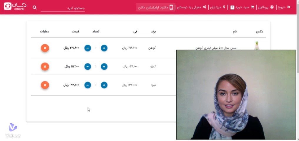
Testing Scenario: Buy fruit juice and dairy via the Dokan website as if from work
Tools Used: Reflector App, Bandicam, Laptop-based facial recording
Data Collection: Task observation, think-aloud method, QUIS (Questionnaire for User Interaction Satisfaction)
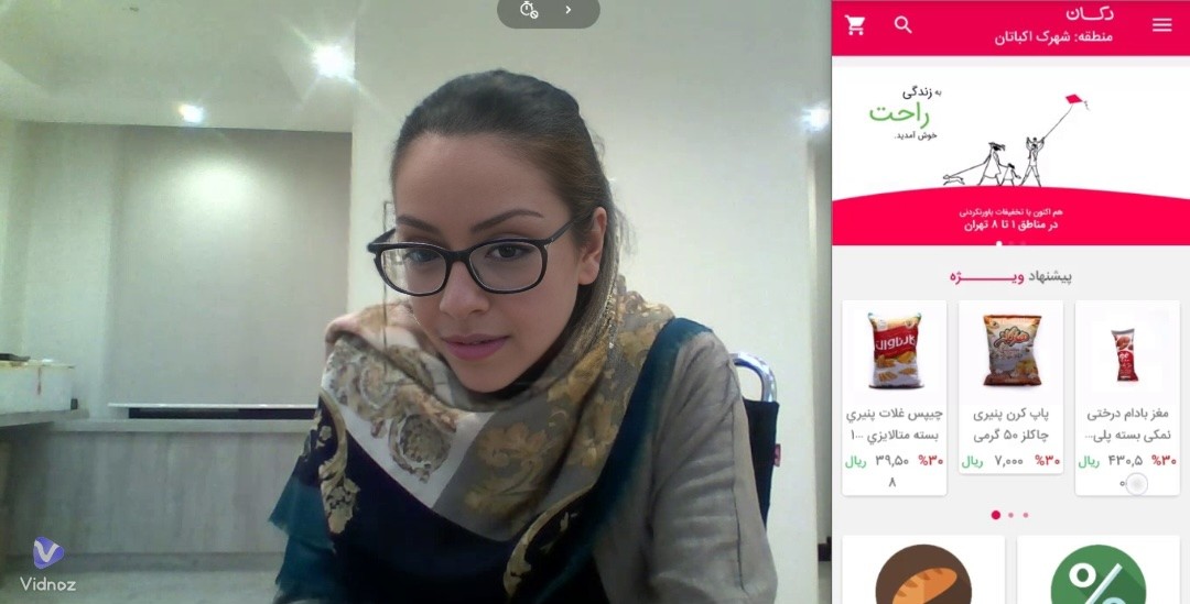
A participant interacting with Dokan Android app (Face is ai generated)
Key Findings
1- Task Success Rate ✅
Task
Sign-Up |
Add to Cart |
Finalize Order
Success Rate |
|---|
Moderate
Low |
High
2- QUIS Results (User Satisfaction) 📊
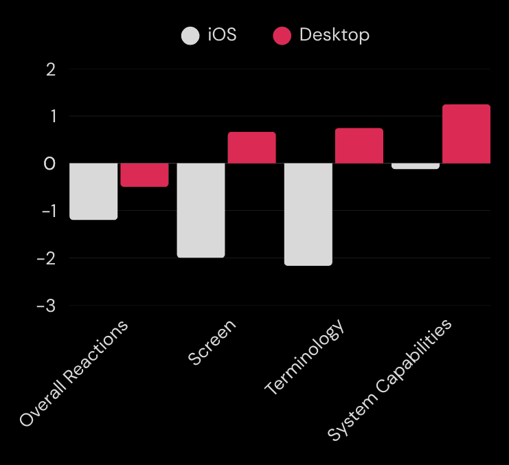
iOS and Desktop apps received mixed ratings.
Terminology was especially criticized for iOS users.
Desktop users had slightly better responses, but both platforms had room for improvement.
The visibility of alerts for Desktop users is slightly better.
3- Critical Usability Issues ❗
Task
Sign-Up |
Add to Cart |
Finalize Order
General
Issue
Users confused sign-in with registration |
No visual confirmation of added items
|
Search functionality poor; irrelevant results or no feedback
Severity
8/10 |
6/10
4/10
High
User Quotes
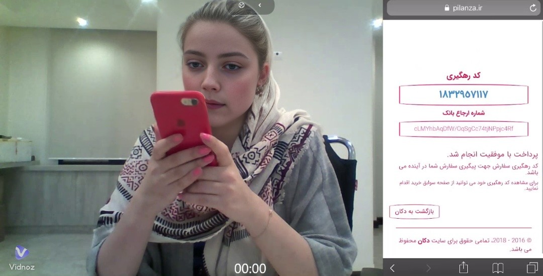

Our test participant in this stage (Faces are ai generated)
"I can’t find Lavazza coffee, even with a search!"
"I don’t know if it’s been added to the cart or not."
Design Recommendations
Streamline Sign-Up
Merge sign-in and sign-up into a unified flow to avoid user confusion.
Improve Microinteractions
Add a badge counter on the cart icon to confirm item addition.
Redesign alerts and system messages for clarity.
Refine UX Writing
Improve terminology and labels, especially in product categories and actions.
Rename unclear CTAs, e.g., change “Validate” to “Apply” for discount codes.
Enhance Checkout Transparency
Add a final review page summarizing the order.
Avoid error messages that don’t apply (e.g., warning about changing postal code when cart is empty).
Impact & Reflection
This usability study revealed how small friction points can dramatically reduce user trust and conversion. Post-research, proposed UX improvements were prioritized and handed over for implementation.
This project emphasized the importance of continuous usability testing in high-frequency use cases like grocery shopping.

Let's work together
If you have a project in mind or would like to chat, please feel free to book a call. I'd love to hear from you.